SOCIO-ENVIRONMENTAL, PRODUCT &
INSTRUCTIONAL DESIGNER
Designer for the Human Experience
EN
Ogilvy + Colgate
Oral Health Assessment
WhatsApp Chatbot experience
Jun → Sept 2024
UX /UI Design

AI-powered WhatsApp chatbot that brings oral health diagnostics to millions—transforming how Colgate delivers care in emerging markets.
My role:
Lead UX/UI
Client:
Colgate — Bright Smiles, Bright Futures (BSBF) initiative
What was the product?
An AI assessment chatbot that analyzes oral health conditions through user-uploaded photos via WhatsApp. This reimagined a previous Kenya pilot with rebuilt AI, a chatbot developed from scratch, and a completely redesigned report interface.
Goal:
1 million users by end of 2024,
launching first in South Africa.


How it works?
Users photograph their teeth, upload via WhatsApp, and receive instant AI analysis identifying cavities, gingivitis, tartar, and discoloration, including recommendations for next steps depending on severity, or to help establish better higiene habits.
The challenge:
Create intuitive, playful interfaces optimized for low-end mobile devices while navigating WhatsApp's technical constraints, ethical health communication, and Colgate's
brand standards.
I delivered:
A scalable design system and interface documentation that balanced these demands, establishing the foundation for global rollout through 2025-2026.
I designed for diverse audiences across literacy levels and age groups, collaborating with international teams across Brazil, Switzerland, South Africa, Vietnam and South Korea
in agile sprints.
Quick menu:
Assessment & UX Audit
Challenge:
Evaluate the existing Colgate Oral Health Bot to identify usability issues and opportunities for improvement before scaling the solution.
Approach:
Conducted a comprehensive heuristic evaluation of the conversational flow, visual content, and supporting materials (landing page and PDF report) using established UX principles and best practices.

A deck was put in place to ilustrate all the findings
Key Findings over four prominent areas:
1. Conversational Experience
Identified critical gaps in instruction clarity, image delivery friction, and missing feedback confirmations throughout the bot flow.
2. PDF Report Analysis
Desktop-centric format with strong data visualisation undermined by poor mobile compatibility and weak call-to-action design.
3. Landing Page Evaluation
Solid information architecture and impactful infographics were weakened by ambiguous CTAs and hidden content in dropdown menus.
4. Positive Elements Identified
Progress indicators, gauge visualisations, and preventive care predictions demonstrated effective user-centered design principles worth preserving.
Impact:
The assessment informed the redesign strategy,
prioritising mobile-first design, clearer communication patterns, and reduced friction in the user journey.
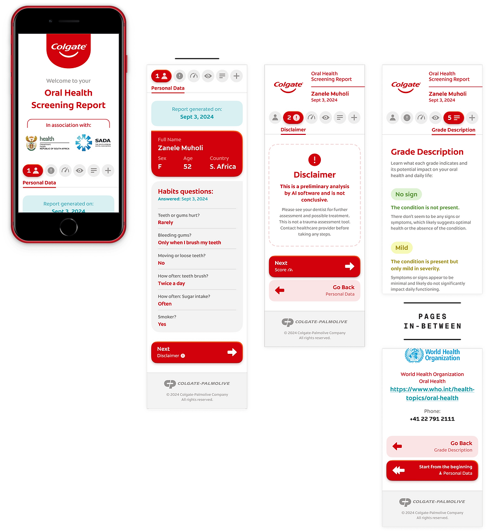
Oral Health Report:
The report is the last user touch point in the experience, so it had to delight. It was fetched through the end of the WhatsApp chatbot flow, delivering a friendly, grade-based assessment to the person.


What does the report highlight?
1. Personal data, report date and habit answers
That is useful for documentation — future assessments, dentist's evaluation
2. Status of the overall mouth health
3. A disclaimer about the AI usage, as preliminary
4. Conditions
The grade / what is it / main symptoms and recommendations
4. Grade descriptions
6. CTAs
Share buttons / BSBF's initiative + video / State Health Agency + WHO
➤ Spot the numbers in the image


Versions:
Three versions were made throughout the project to accommodate technological limitations brought up by the tech team.
1. Scroll-based
2. Paginated
3. A4 paginated (final — image above)
All versions, although very different usability-wise, were thoughtfully designed with the user's best interests, delivering easy navigation and glanceability no matter the size of the page.
1. Scroll-based
The screens represents the different sections of the whole scroll

2. Paginated
Some of the sections were ommited to focus on the main differences
And to support all the UI,
a colour palette was made following
Colgate's brand guidelines:

Chatbot flow:
The complete flow was divided into 9 parts for hand-off (below), contemplating all chat essentials + technology activations.
The legend was crafted specifically for this project.
1. Start/ Opt-in
2. Personal data
3. Screening
4. Form
5. Conditions + Report
6. Share more
7. Rating/ End
8. Intentions
9. Intentions (Conditions)


Hand-over
Component list:
To finish the job in the best possible way, I crafted a detailed, self-orienting guide of all the components used in the User Interface.
The whole interface was already modular when I handed over, so the dev team only had to focus on the details of making it work with the input data.


I was extraordinarily grateful to have worked on this project. Not because I knew I was designing to a broad, vunerable audience that truly needed that help, but also because of the challenge, sensibility and the sheer scope of such an idea.
And I had to give the answer to many of the features.
I learned a lot.
Balancing the right fundamentals with the arguments and getting to know the constraints on the go was not an easy task, but it taught me how far should I go with an idea, where to search for those answers and who to truly ask for advice.
All the UI and Flowcharts were made on Figma.